Anatomy of an icon
In late 2022, Nicolas was really getting into his side-projects, Type, a note-taking app for the busy mind. He reached out for some help, and designing an app icon was a fun and different challenge from my day-to-day work. It was something I hadn’t done in a long time.
The process was relatively short. Here are most of the steps that led to the final Icon.
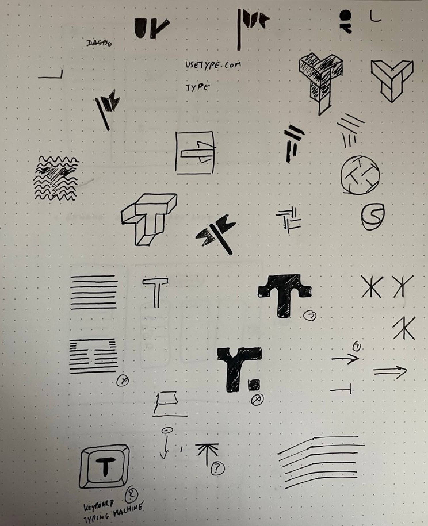
Quick sketches
Starting with quick sketches helped us align on the different directions we liked and disliked. Without much doubt, the idea of a keyboard key made more sense than any other idea.
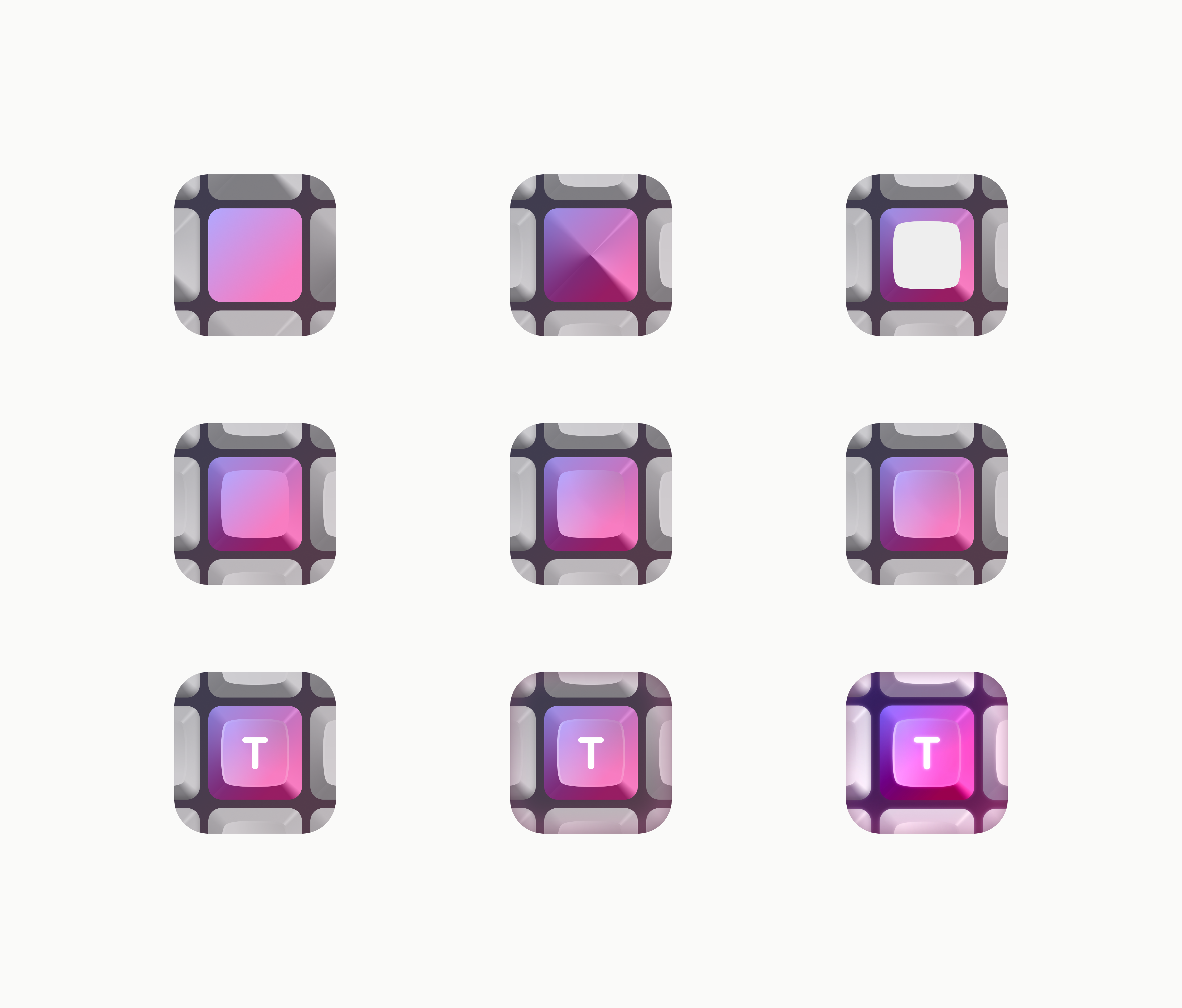
Playing with the key
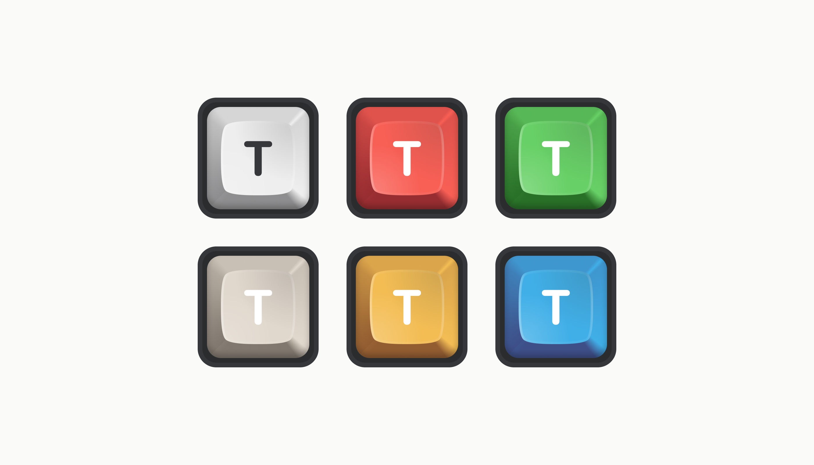
The first few high-fidelity keys had a retro feel but were kind of bland. I tried a couple of alternatives with tints or combination of more than one key.
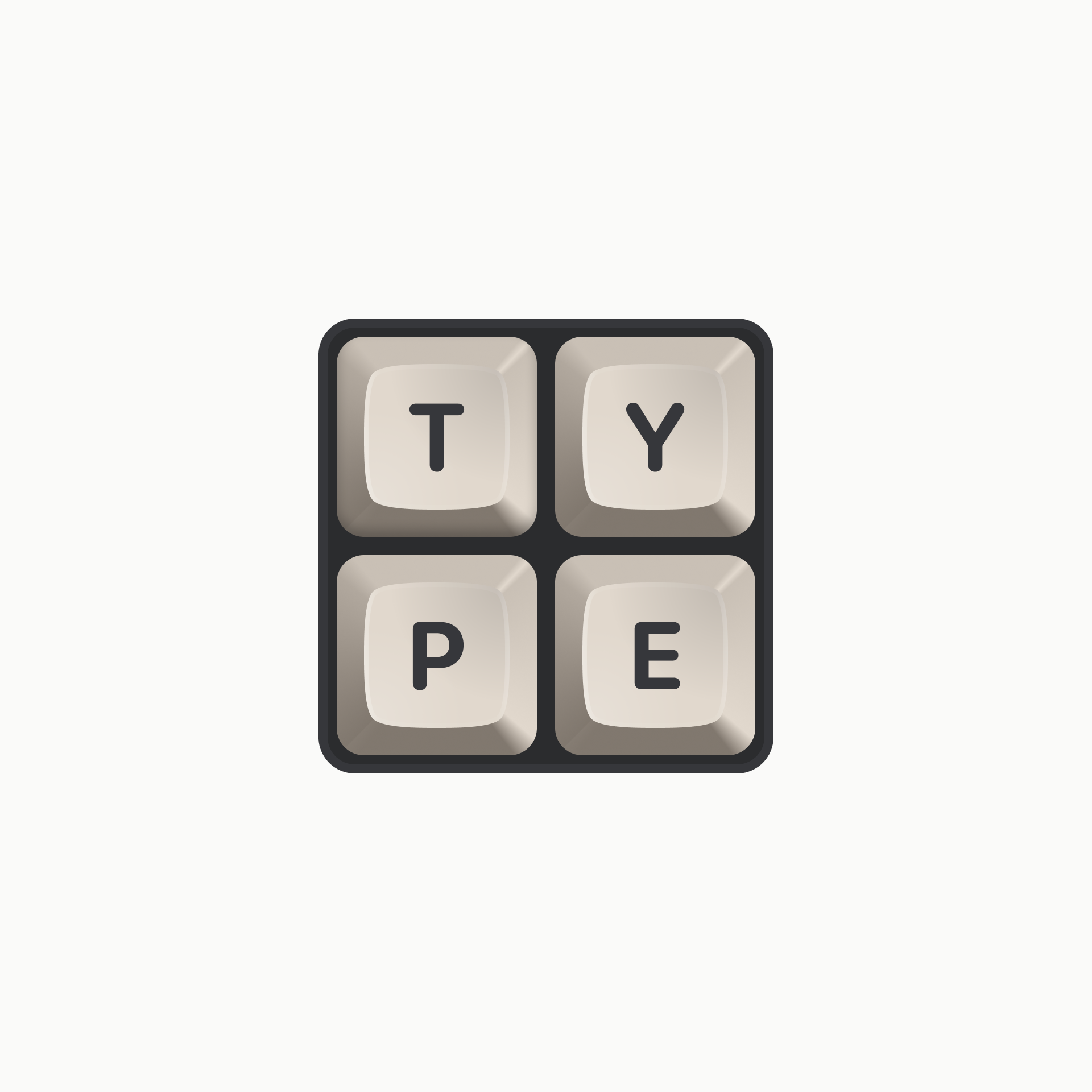
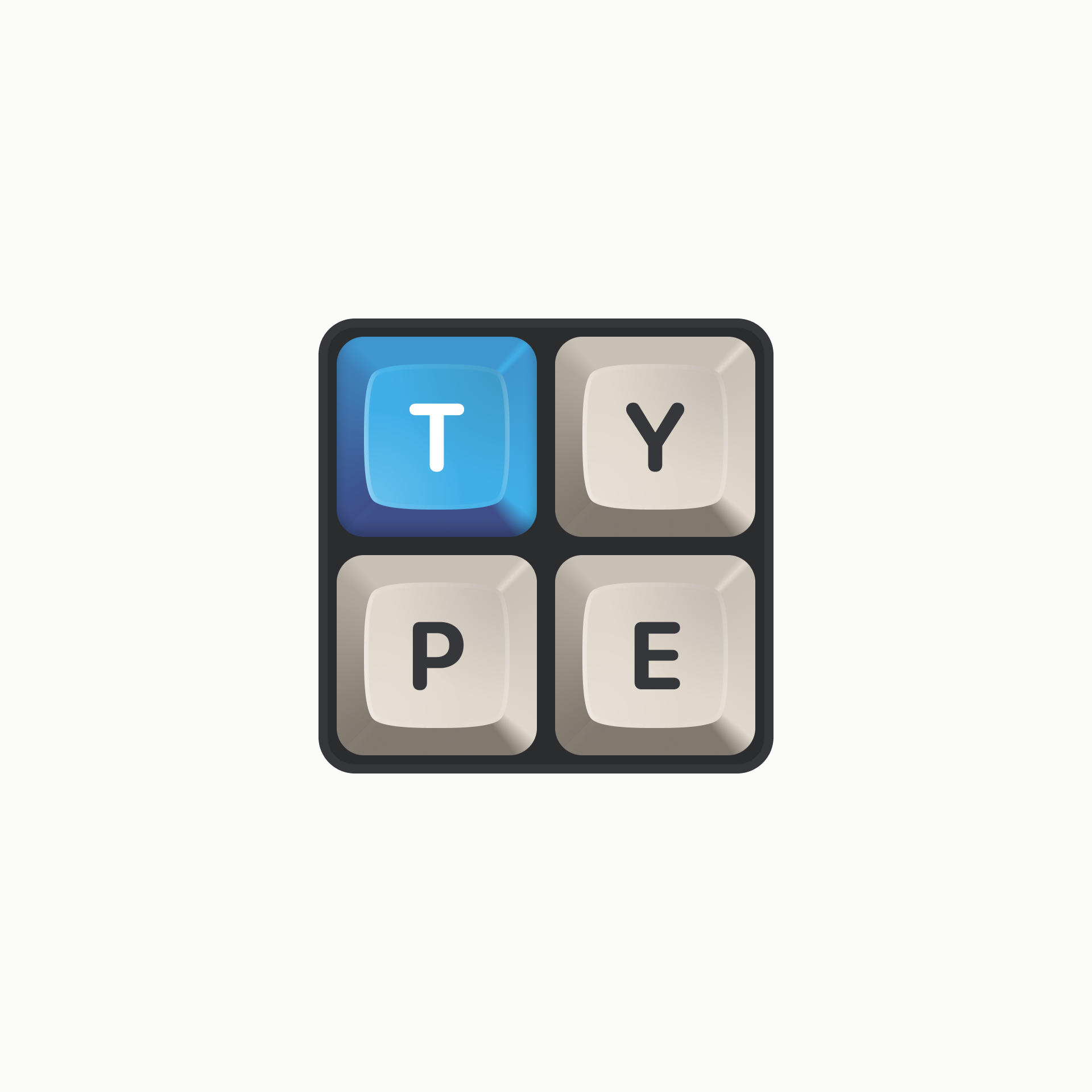
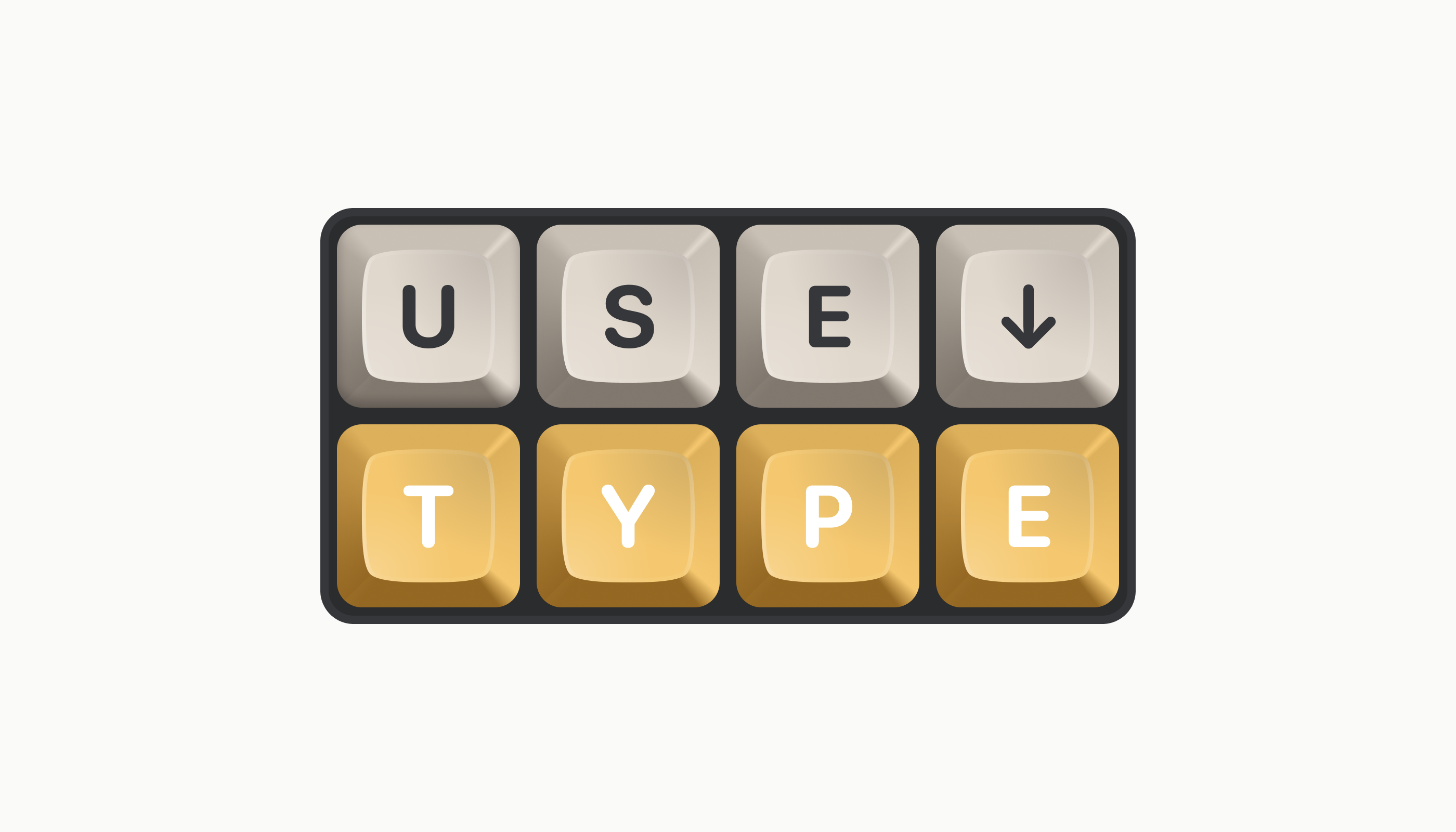
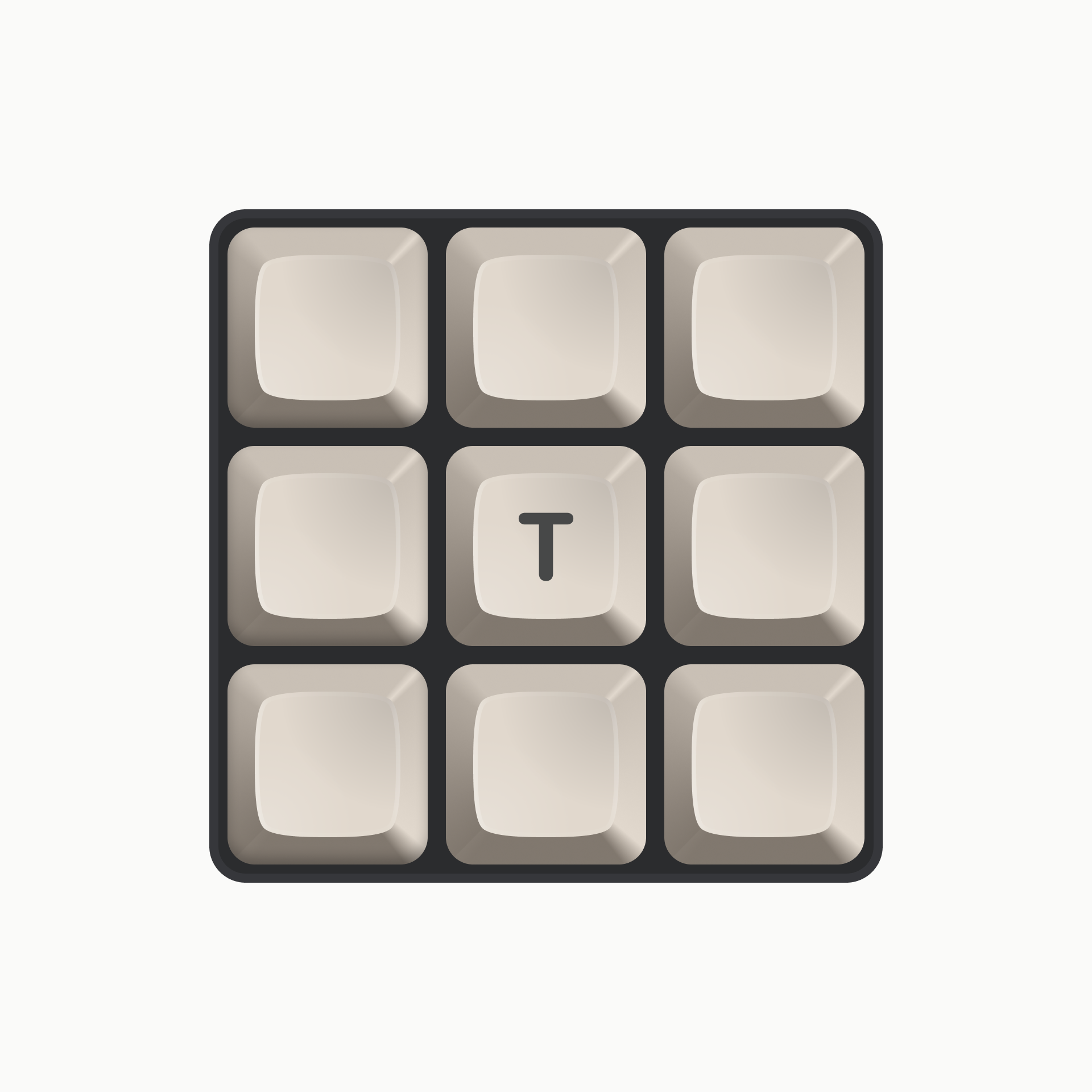
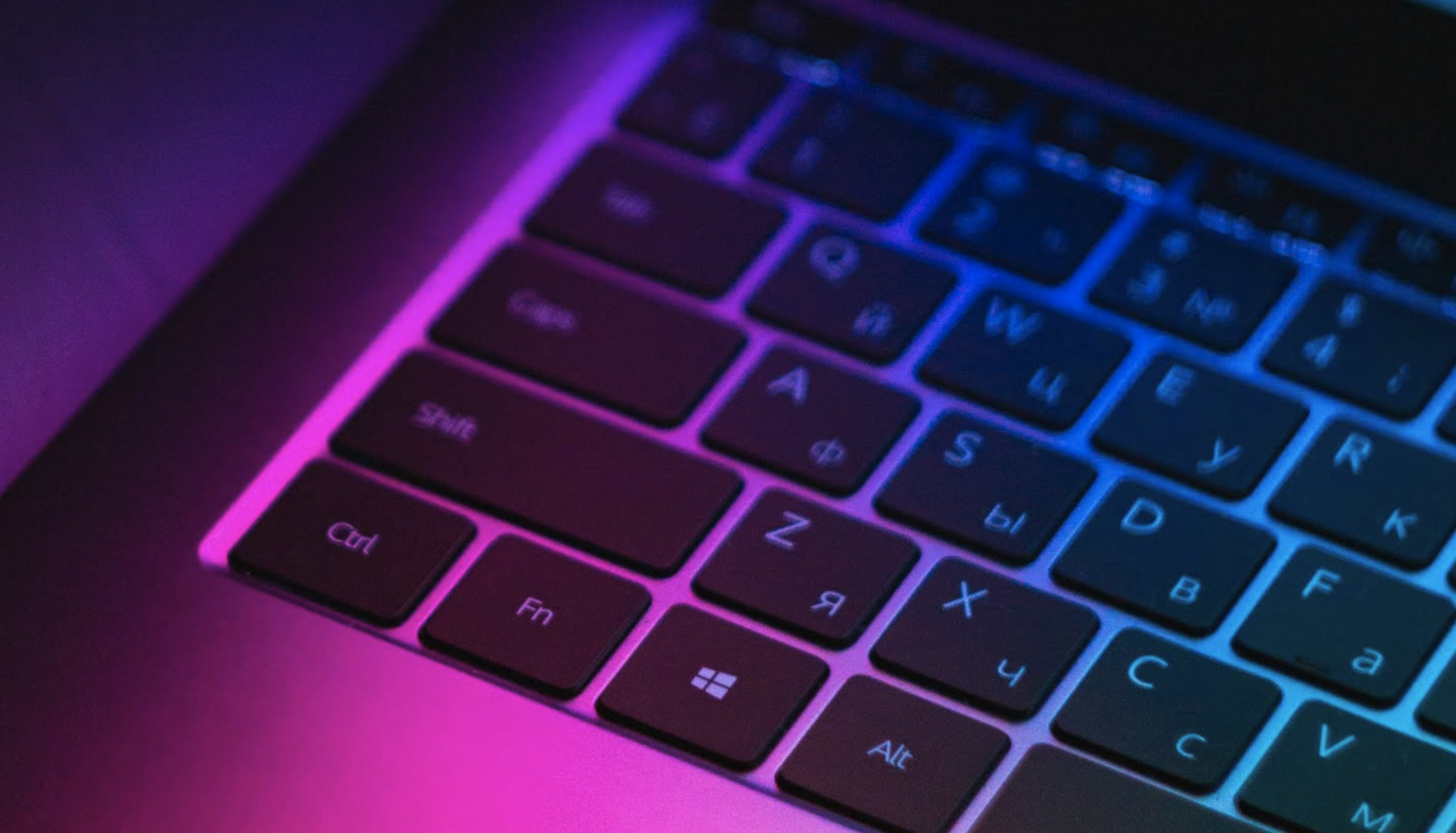
More substance
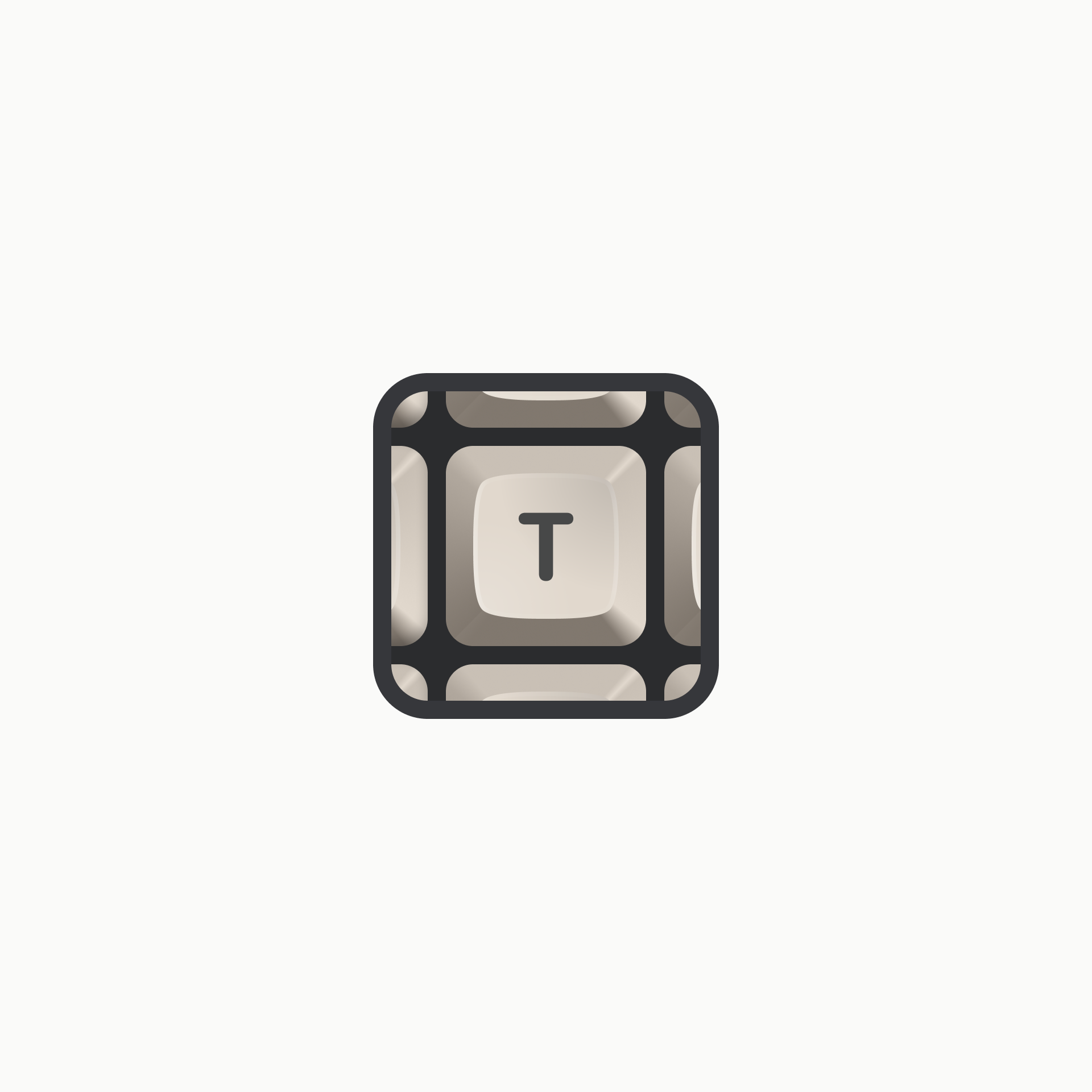
A key by itself wasn’t strong enough but surrounding the main key with other keys made it feel more “realistic”, keeping the focus on the main key “T” was our final decision.